15 seconds. That’s all the time merchants have to capture a user on their website — according to Tony Haile, CEO of Chartbeat.
A website design must be picturesque in order to capture a visitor's attention, and BigCommerce has made the design process much easier. BigCommerce websites have over 100 themes to choose from and endless marketing features and integrations.
Since becoming an Elite BigCommerce Partner Agency, we’ve had the privilege of working with companies to build stellar user experiences for their customers. Below, we’re sharing some of our favorite BigCommerce website examples and hope they inspire you to tackle your eCommerce design.
BigCommerce Website Examples: 3 of Our Favorites
BigCommerce Website Examples: White Shanty
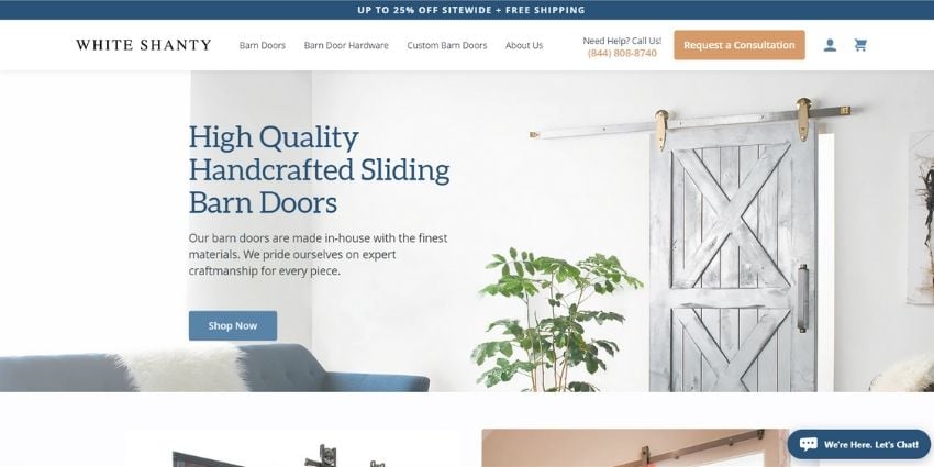
White Shanty uses clear CTAs on their homepage as well as a unique value proposition (UVP) at the top of the page. Due to its placement, their messaging is one of the first things people notice, and it incentivizes website visitors to purchase by offering a discount and free shipping.
The most important information is placed above the fold, like the “Request a Consultation” and “Shop Now” buttons. This is a perfect example of what an uncluttered, clean-cut website design looks like.
In addition, see how our team built a custom product configurator that allows customers to seamlessly customize their barn door directly online. This product page functionality streamlines the user experience through direct online purchases (without the need for a sales or customer service team.)
BigCommerce Website Examples: HANNA
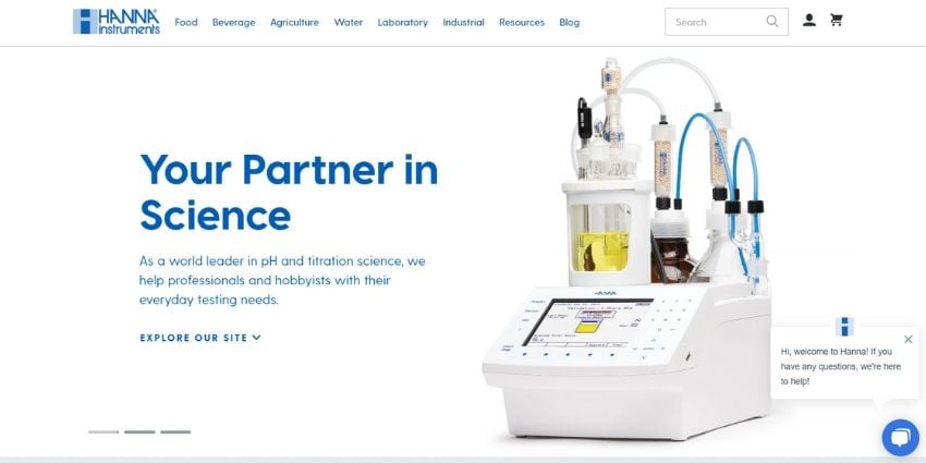
Hanna Instruments offers a wide variety of high-quality analytical instrumentation, so we’re loving how simple they kept their homepage. The arrangement of their site and the simple “Explore Our Site” CTA keeps the homepage looking uncluttered and minimalist. The same CTA, when clicked, guides visitors through the different industries their products are useful in and allows visitors to learn more.
BigCommerce Website Examples: Cutter & Buck
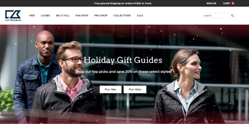
In this last of our BigCommerce website examples, Cutter & Buck strategically placed its UVP at the top of the page so that it’s one of the first things visitors see. The free ground shipping incentivizes customers to spend at least $50 to qualify. The high-quality image features 3 people wearing Cutter & Buck products and keeps the homepage looking clean. With minimal CTAs (“For Her” and “For Him”), visitors know exactly where to go to find what they’re looking for.
Conclusion
Selecting an eCommerce platform is one of your business’s largest investments for growth, and we hope you're inspired by these BigCommerce website examples. So how do you know if this platform is a good fit for your business? The benefits of BigCommerce and the variety of features it offers makes it more than just a website builder. If you’re looking to expand and operate your business online, BigCommerce provides you the proper tools to do so.
Do you want your eCommerce store to look like any of these BigCommerce website examples? Contact our team through the form below for a demo, and we'll be happy to help!

E-BOOK
20 Best Shopify Apps For Your eCommerce Store
Explore tags:
About the author
Bethany is an eCommerce expert who loves to share her tips on increasing online-generated revenue.
Subscribe to the Groove Newsletter
Get the latest updates and insights straight to your inbox

![32 AI eCommerce Tools To Start Using Today [2024]](https://www.groovecommerce.com/hubfs/2023%20Website/Blogs/AI%20Blog%20Social%20Media%20Tools/7%20AI%20Tools%20For%20eCommerce%20Merchants%20To%20Start%20Using%20Today%20-%20Promo%20Image%20Large.jpeg)


