
As a retail store owner, choosing the perfect store layout design for your business can quickly become a very sobering, even stressful thought. According to Fohlio, 52% of shoppers won’t return to a store if they dislike its aesthetics, and 93% of purchase decisions are based on visual appeal.
So it’s imperative that you stay in tune with the psychology of a great retail store design to maximize sales. The choice of such a layout depends mainly on your target market, the size of your store, and the types of products you sell.
In this article, you’ll discover some common tactics you can implement to create a sales-friendly retail store layout. You’ll also learn more about retail consumer behavior and how that behavior is essential to having a well-thought-out store layout.
Table of Contents
- Use the right floor plan
- Identify traffic flow and customer behaviors
- Find a good spot for your checkpoint
- Refresh your displays more often
- Priorities for vertical shelving
- Leverage endcaps
- Use cross-merchandise strategies
- Add low-priced impulse products to your checkout
A Step-by-Step Guide to Planning Store Layouts That Optimize Your Space
Retailers, consultants, store planners, interior designers, and architects all use a variety of retail plans and concepts to influence customer flow and behavior. Retail giants and small independent retailers alike can improve the customer experience and, in turn, their long-term profitability through effective store design. Learn more about some of the steps involved in planning a store layout that optimizes your space here.
Step 1: Use the right floor plan
The first step to maximizing the cost-effectiveness of your retail space may be the most unavoidable, but the concept and knowledge of customer behavior are essential to understanding your overall layout strategy. Each floor plan and store layout depends on the type of products sold, the location of the building, and what the company can afford to put into the overall store design.
A solid floor plan perfectly balances an optimal customer experience while still maximizing revenue per square foot. Retailers far too often overlook the former of these two aspects – they focus on revenue and prefer to sweep the customer experience under the rug. Retailers who provide a good experience have higher revenues than those who don’t, even if the square footage is comparatively smaller.
For example, some retailers clutter the sales floor with too much merchandise. While this increases choice, it also reduces customer traffic space. Overcrowded stores overwhelm many consumers, who typically prefer cleaner, wider aisles that minimize the stress of shopping. Take a look at pretty much any of the major U.S. department stores. They’ve made this approach to their layout a clear priority.
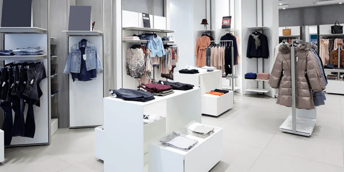
While spaciousness and cleanliness are paramount to providing a great shopping experience, retailers do have some choices when it comes to the style of their layout. In the past, we covered eight different types of retail store floor plans: Free-Flow, Grid, Straight, Racetrack, Herringbone, Diagonal, Angular, and Geometric/Mixed.
Step 2: Identify Traffic Flow And Customer Behaviors
The next step in getting the most out of your retail space is identifying your customer flow. The most effective method of understanding your existing customer flow and identifying areas of opportunity is through video recording and heat mapping analysis. This service is available from solution providers such as Prism (you can also run a quick search online for heat mapping consultant services in your area).
As a more manual approach, you can also set aside different times of the day to conduct in-store observations in person and record your notes. This is also an excellent way to identify customer flow patterns.
There are some key customer behaviors you need to understand and address in this part of your floor planning:
Decompression at the entrance
When a shopper enters a store, retailers need to shift their mindset to a calmer state, allowing them to have a more positive shopping experience and spend more time, and, ultimately, money at your store. This is why the decompression zone is so critical; it enables the consumer to adjust to the outside ‘noise’ and focus on the actual shopping experience without distraction.
To meet this need and ensure that your customers are not overwhelmed upon entry, you should create a decompression zone within your entrance’s first five to fifteen feet. As they enter, they take stock of your store, form an opinion about your brand, and may even unconsciously judge the items and prices they expect to find.
The right turn
In the United States, most customers automatically turn right when they enter a store. That’s why you should steer customers to the right and highlight the right side of your store. The right side of your store, especially the area just past the decompression area, is the best place for promotional displays.
“For example, walk into a Safeway grocery store in the chain’s upscale Marketplace format, and your eye is drawn to the floral department on the right. The bright colors and floral scents remind customers of happy times in their lives”, says Dyches, director of customer experience for retail branding firm Ikonic Tonic in Los Angeles. It puts shoppers in a good mood and encourages them to move to the right and start walking around the store counterclockwise.
Personal space
Customers don’t like to feel crowded when they shop, so you need to provide enough room to move around. Aisles should be wide enough to allow customers to stroll, not bump into other customers, and most importantly, pick up and carry items to the checkout to make a purchase.
Aisle width is an essential aspect of good store planning. It is recommended to have aisles at least 3.5 feet wide so that strollers and wheelchairs can fit comfortably and customers can navigate both sides without feeling crowded. Also, consider whether your customers will be using a cart or baskets so that you can provide extra space for two-way passage.

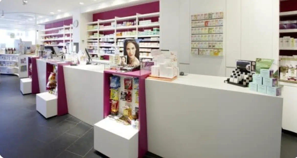
Step 3: Find a Good Spot For Your Checkout
A checkout counter, of course, is a place in a store where shoppers go to pay for the goods they want to buy. It is the part that houses your point of sale (POS) system or cash register. Customers scan items purchased at the register and pay with cash or electronically by credit or debit card.
Typically, the front left side of a retail store is an ideal location for the checkout counter. Consumers naturally move to the right as they enter a store, make their purchase, and leave through the left.
A checkout counter located at the front left of your store sets the last step of the shopping experience on your customers’ natural exit path. Additionally, this location doesn’t divert customers’ attention from their purchases or take up product display space.
Although the front-left location is best for most businesses, it makes sense to place the checkout film at the back of the store for some stores. This is perfect for large retailers with many associates in the store at a time, as it frees up space for products at the front of the store. However, back-of-store placement is not practical for smaller retailers with limited staff, as this placement can potentially leave the front of the store unsupervised.
Step 4: Refresh Your Displays More Often
Several factors can influence how often you refresh your store’s displays: how often new merchandise is delivered, whether your products are seasonal, and how regularly customers return.
Keeping your displays and merchandise assortment updated regularly will give customers a fresh look at new products each time they enter your store. Try different strategies to refresh your displays. For example, rotate products weekly or bi-weekly to see how this affects sales. You can do this by moving merchandise from the middle of the store to the front and from the front to the back, or any other way you see appropriate.
Whenever you receive a new shipment of merchandise, it is essential to display it immediately and in a high-traffic area of your store. The goal is to ensure that customers do not become so familiar with your store and the merchandise you display that they stop coming in.
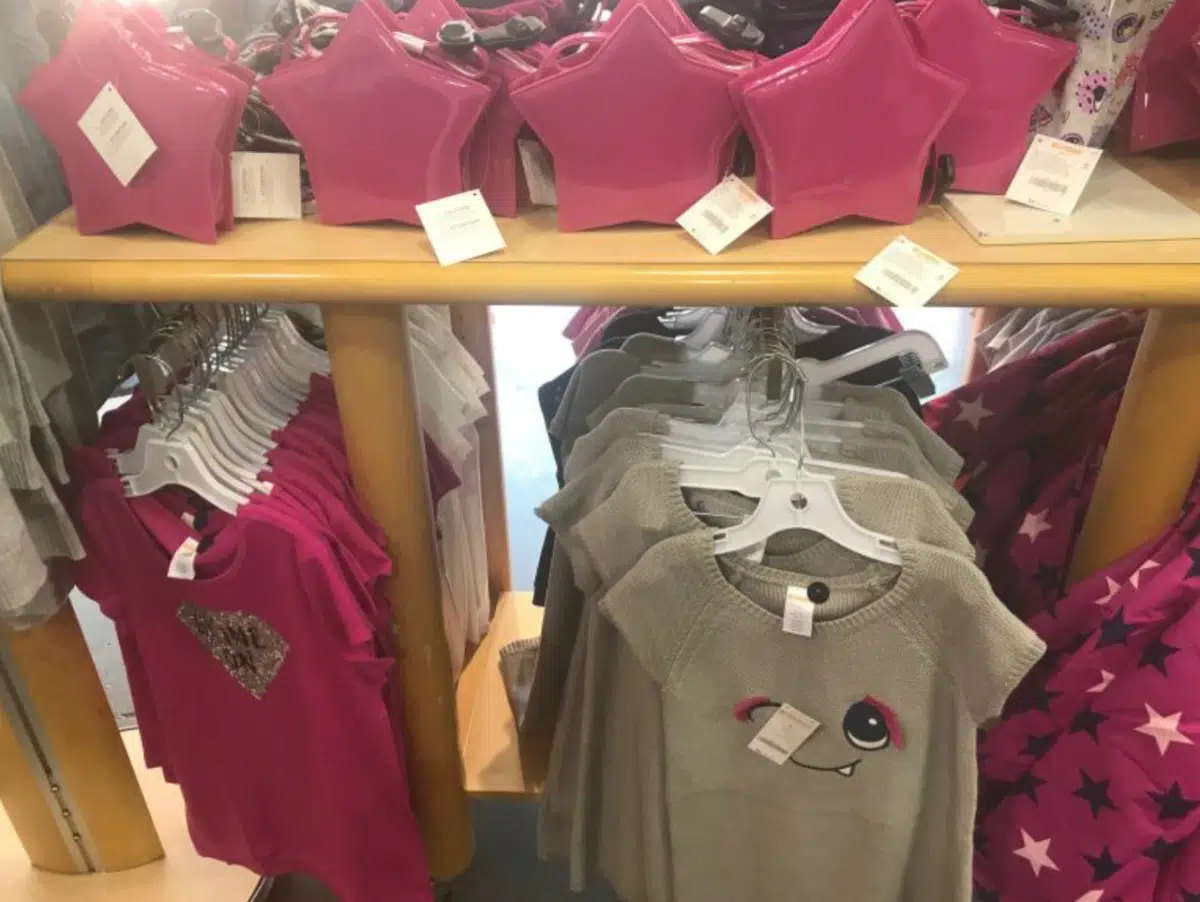
Step 5: Priorities for Vertical Shelving
Products are organized vertically in most brick-and-mortar stores, based not only on the type of products they sell but also on their target customers. Usually, the products that generate the most sales or are the most desirable are placed at eye level, making them easier to see, while the lesser-selling products are at the top and bottom of the shelves.
Bonus Tip:
You can identify the most sold products or the key products thanks to ABC analysis, an inventory management technique allowing you to classify the products in your store according to their importance. Make sure your retail POS system can generate an automated ABC analysis.
However, eye level varies by target audience and should be considered. For example, brightly colored breakfast cereals targeted at children are often placed at children’s eye level in shopping carts, slightly lower than the eye level of the average adult.
Step 6: Leverage Endcaps
The endcaps of the aisles attract customers’ attention. Customers looking for a specific aisle will naturally be distracted by these displays, and they tend to hold your attention as you walk through the store. In addition, these endcaps are distinguished by the considerable space between them; therefore, most stores try to place their best products in one or more endcap displays.
An endcap is a display for a product placed at the end of an aisle. It is seen as giving a brand a competitive advantage. There are not many products or displays to compete with them.
Step 7: Use Cross-Merchandise Strategies
Grouping your merchandise into neat categories or departments is a great strategy, but see if you can find room to cross-merchandise different items. Identify products in your store that would work well together and put them on the same display. Shirts & pants and shoes & socks are examples of combinations you can make.
This display from Gymboree, which features a range of shirts and sweaters with a matching handbag, is a perfect example.
Step 8: Add Low-Priced Impulse Products To Your Checkout
Place impulse items such as small toys, candy bars, lip gloss, or other small, inexpensive items near your register. When customers approach the checkout counter to pay and leave, you don’t want them to stop shopping.
By placing low-cost impulse purchase items near the registers, as shown in the image below, you encourage customers to add an item or two when they check out, which will increase your sales and give your profits a boost.
Almost all of a store’s layout design is focused on merchandising. Once the floor design is developed, though, significant analysis is appropriate to determine the flow from your receiving dock to the shelf.
- Are you receiving full cases, inner cases, broken packages, or a combination that determines the physical amount of space needed?
- Will all of the inventory go on the floor, or is a backup inventory (in the back room) needed?
- How often do you receive inventory?
- Given these and similar considerations, what is the size and configuration of the backroom?
- What equipment is required for receiving, possible storage, and warehousing?
These factors impact floor efficiency and labor productivity. Make receiving new inventory seamless and take some of the burdens off of your retail team.
Get Started with KORONA POS today!
Tell us a little bit about your business and explore all the features that KORONA POS has to offer. And there’s no commitment or credit card required.
FAQs: Retail Store Layouts
Store layout allows retail businesses to understand the revenue per square foot they are making by guiding customers through the store and exposing them to their products, while managing the important stimuli that encourage buying behavior. Customers’ perception of your store is an important part of your brand and should be designed with as much care as other aspects of your business.
You design a retail store layout according to the store design floor of your choice and the size of your store. You will also need to have a clear idea of the type of customers you have, their preferences, and the products you sell.
You start designing your grocery store layout by first thinking about the floor layout. However, no matter what type of store floor design you choose, almost all grocery stores start with the produce department, then line the walls with meat, seafood, deli, and bakery. The center of the store encompasses the dry goods grocery department, beer and wine, health and beauty departments. The front end is where cashiers and baggers finalize the shopping experience.
Retailers use store layout to influence customer behavior by designing store flow, merchandise placement, and ambiance. Knowing your consumers allows you to streamline your retail marketing strategy and make better adjustments to your store layout.