
Page layouts for checkout: a vital factor for e-commerce conversions. Unlike physical shops, where the frustration of people standing in the checkout lanes is a telltale indication of discomfort, online retail checkout lacks the immediate recognition of the buyer’s journey’s points of friction.
The checkout page on an eCommerce website is arguably the most critical page for e-commerce checkout strategy. However, the majority of designers pay far less attention to it than it merits.
Imagine adding a few items to a shopping cart and being confused by extended form filling that never seems to stop and continue to checkout. You don’t want your eCommerce website to make the same mistake.
We took a tour of the Internet to help you find the right design for your site’s checkout page and put a list of excellent checkout page designs.
These are the checkout pages that each day produces sales worth thousands of dollars, or maybe even more. For performance, they are configured. You will certainly learn from them a great deal. Take a peek.
7 Best Ecommerce checkout examples for 2021
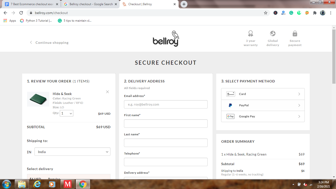
1. Bellroy’s checkout:
It provides its users with one-page checkout, compacting the entire checkout steps on a single page only. The one-page checkout structure for the clients makes the operation simpler and shorter. On the same tab, users can fill out the delivery address, billing address, choose shipping options and provide payment information.
The user interface was further streamlined by including a collection of only the requisite information needed to be filled in. Owners of eCommerce stores that want to provide consumers with a convenient, fast and Easy checkout ecommerce experience can use a one-page checkout structure and save customers time and effort.
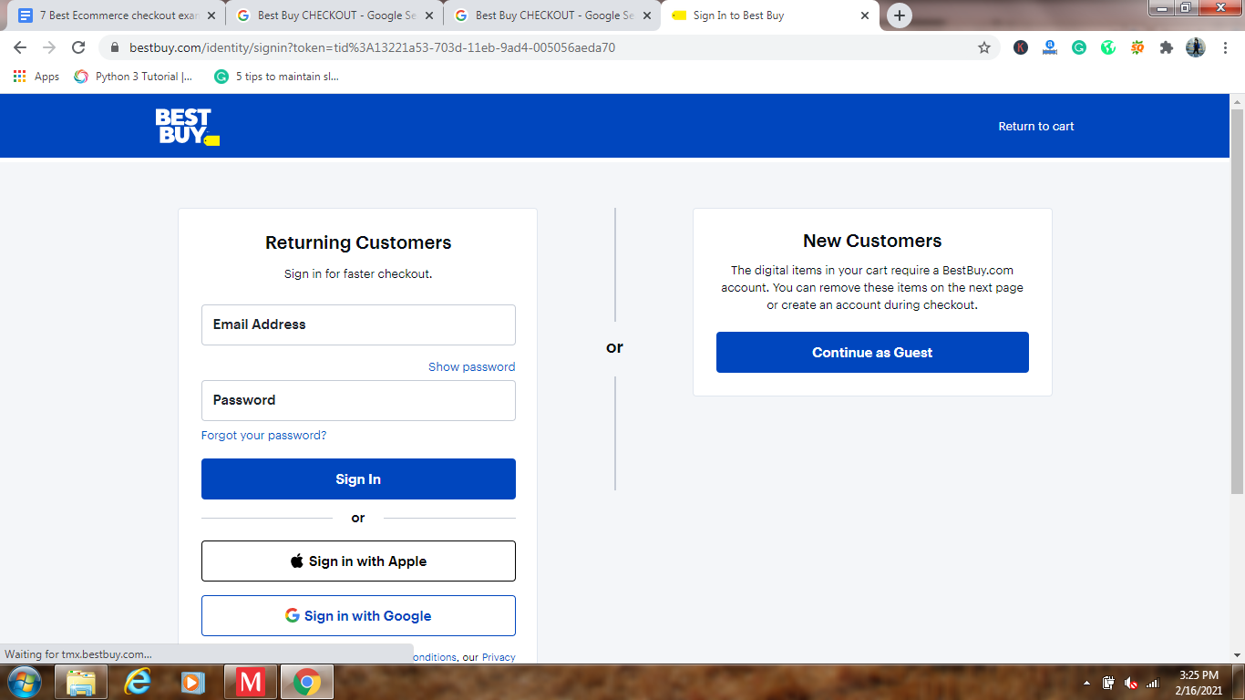
2. Best Buy:
The most outstanding quality of the checkout page of the Best Buy website is simplicity. It just asks for information about the shipment and contact info. Then you can proceed to the page about payments.
Best Buy has split the checkout process into several pages to eliminate confusion and clutter. It also helps users to check out products or sign in to an account as a guest.
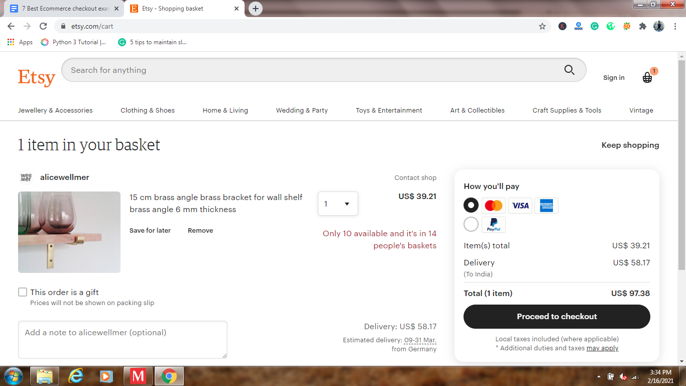
3. Etsy:
Etsy is the largest online shop for arts and crafts that empowers artists to make art and sell it online. Also inspiring is Etsy’s checkout page. Currently, it’s the most straightforward checkout page that we’ve seen.
Without account registration, Etsy allows you to proceed to the checkout as a guest. And, with a clutter-free interface, it requires a simple step-by-step checkout process.
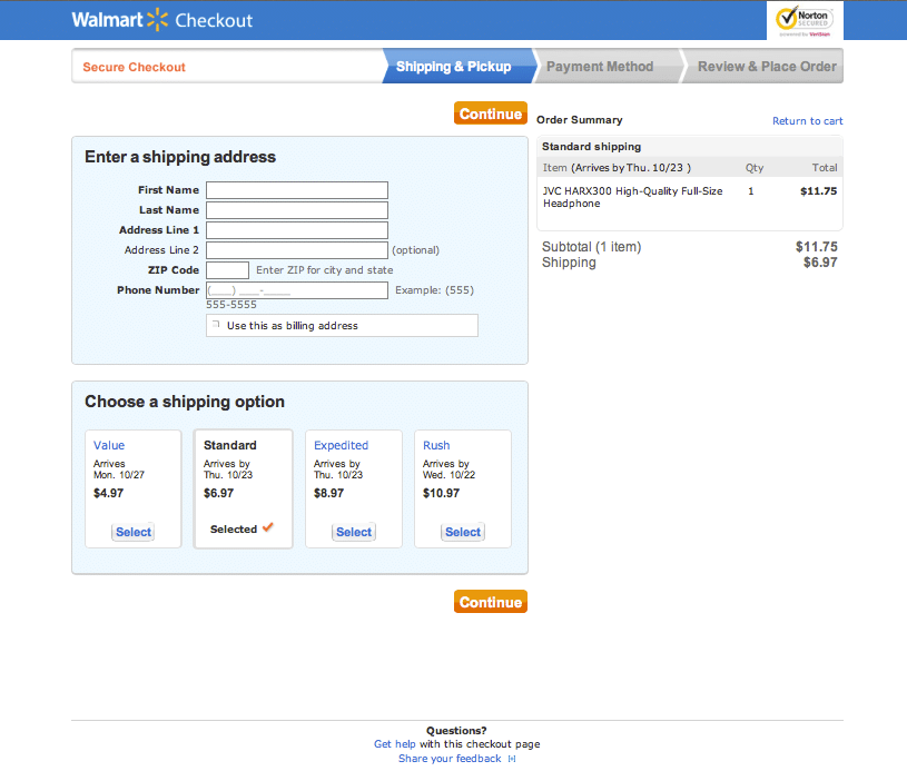
4. Walmart:
The Walmart store is also kind enough to allow its customers to check out products without registering an account.
Its checkout system provides two different options. Customers may either deliver products or pick them up from a shop near them. There are minimal forms for each choice that are easier to navigate and only have a 3-step method.
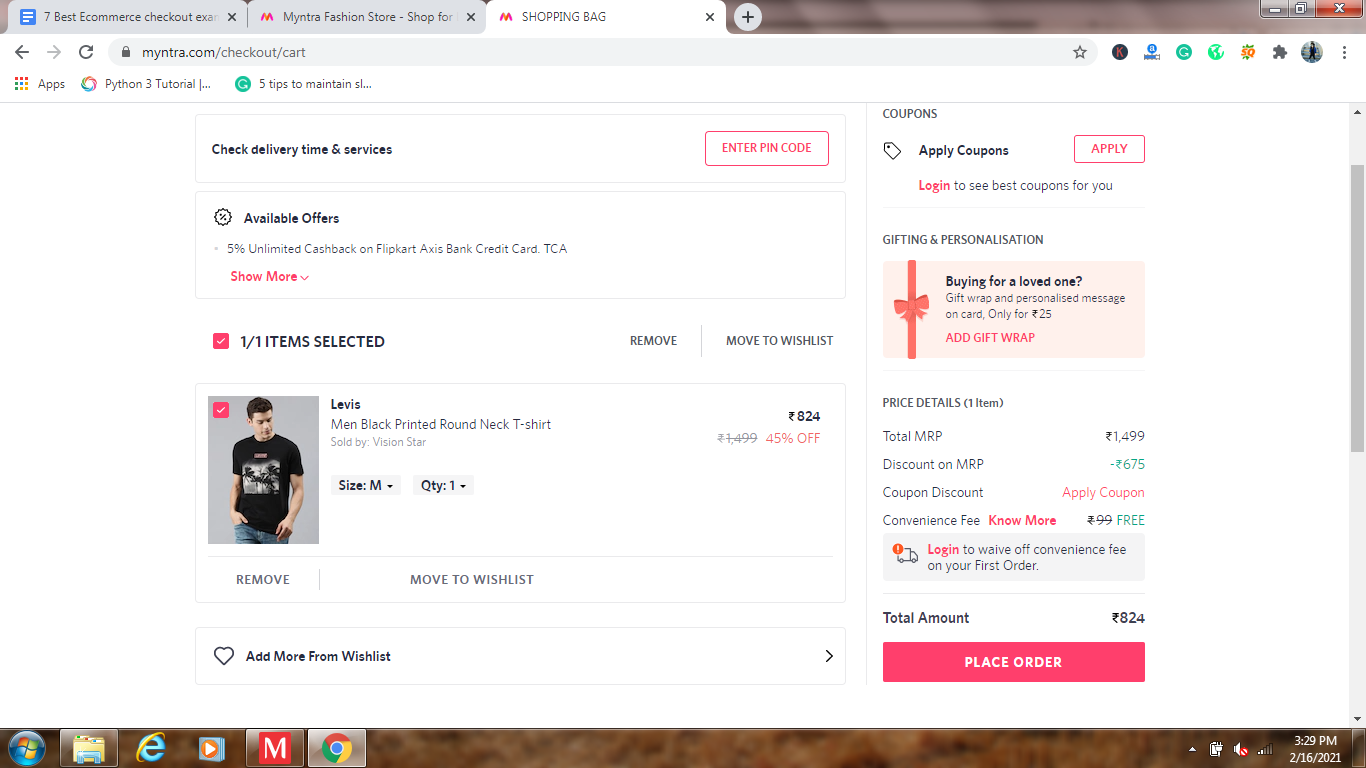
5. Myntra:
One of the Fast checkout designs for ecommerce retail we’ve seen is the Indian fashion online store Myntra. Not only can you move to the checkout page in 2 taps, but it also loads in milliseconds.
Myntra’s checkout page is an opportunity to add more items to the shopping bag from your wishlist (or shopping cart). If the order is issued, the shipping details can be entered, and payment methods were chosen. It does, however, require you to sign up for an account.
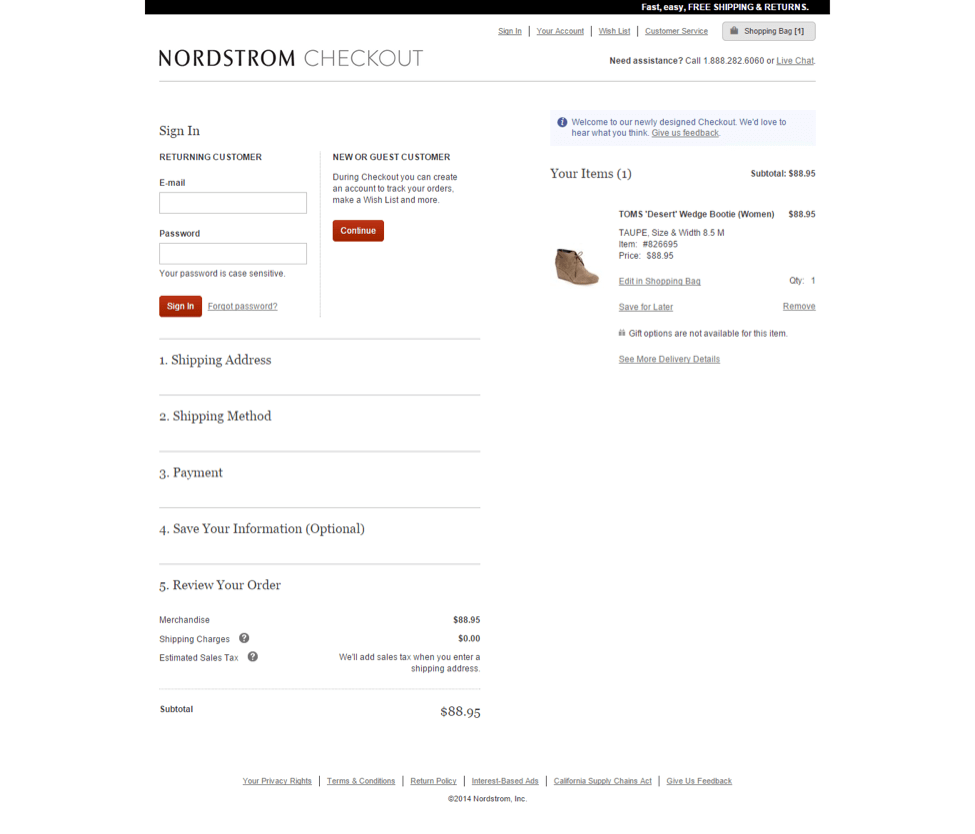
6. Nordstrom:
Nordstrom has a very tidy and minimal page for checkout, too. In 2 phases, the website processes orders. Customers are expected to fill out their contact and shipping details in the first phase. Payment processes accompany the next step.
The way shipping options are displayed on the checkout page is very inspiring. For consumers, it makes things much easier to select the correct shipping form for delivery.
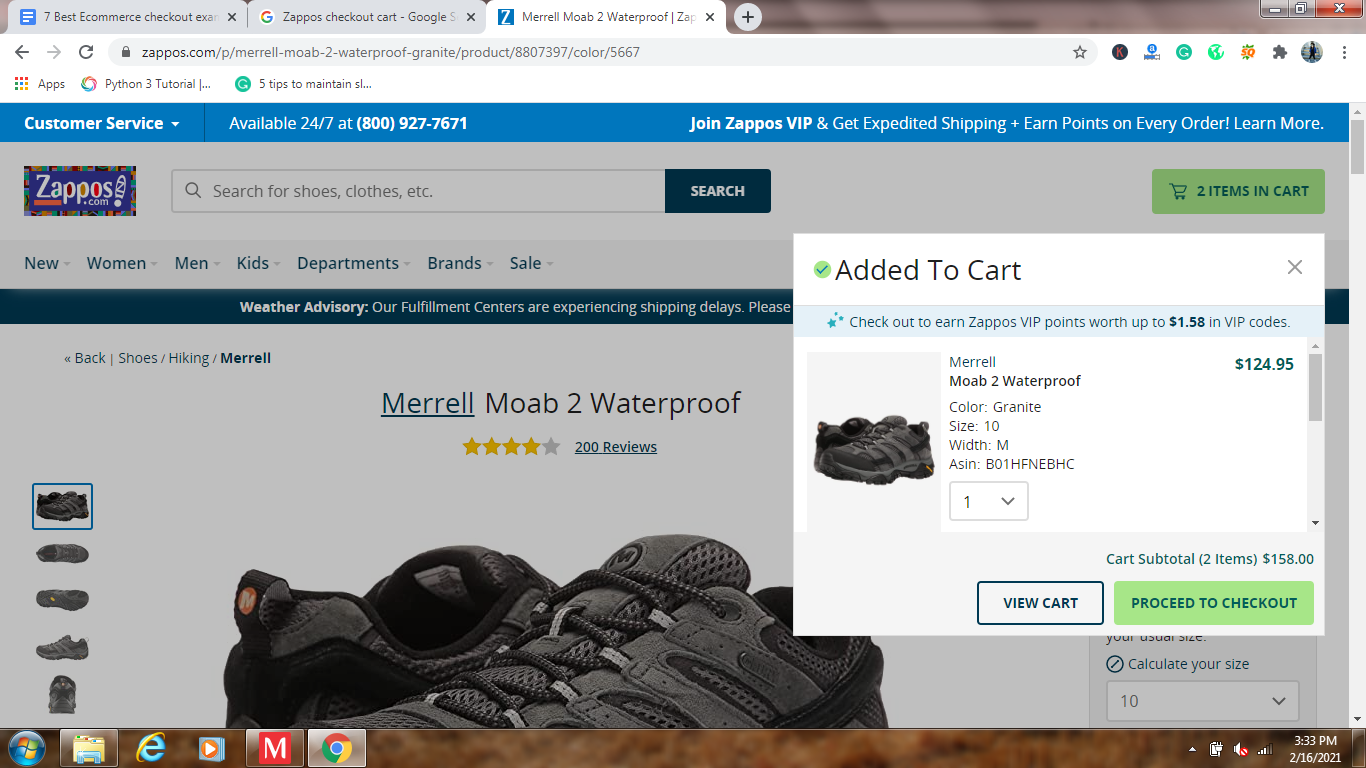
7. Zappos:
The checkout page at Zappos is a little long. But accessing is very simple and features a step-by-step method to direct users through every step. It does, however, enable users to sign up for an account or sign in.
Overall, the Zappos checkout page is pretty straightforward and gives even existing visitors a smooth experience.
Final Words:
Implementing heat mapping and using A/B split testing is a great way to evaluate and develop your checkout page process. The design of a website is never final. To remain relevant, you have to keep improving and updating.
Recommended Reads: