Using Timeless Design Elements for Improving E-Commerce
The days of simple 1:1 interactions are over as today’s customers expect personalized shopping experiences.
Timeless design elements like minimalism are fundamental for intuitive and user-friendly e-commerce experiences.
Test all new designs to determine whether they serve customers while meeting business needs.
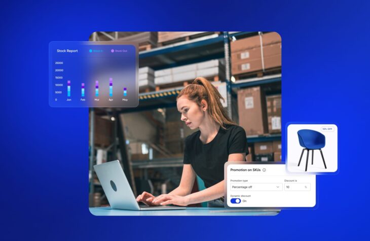
You can implement timeless and creative design elements across all your channels with fabric XM to build lasting relationships with customers.
Design elements shape the first impression shoppers have on a brand or retailer’s website. According to Adobe, 38% of shoppers will leave an e-commerce website if they find the layout unappealing. Moreover, these design elements make an impact on shoppers’ buying decisions. Further research shows that 42% of shoppers are very unlikely to purchase due to poor design.
Ultimately, the user experience (UX) of an e-commerce site impacts your relationships with site visitors and customers. With new technology and ever-changing shopping expectations, it is no longer sufficient to only build fast and easy checkouts or deliver an omnichannel experience. You must also leverage certain design elements to create memorable customer experiences online.
Creative design vs. timeless design
Good design is hard to identify because it “serves us well and fits our needs,” according to Don Norman in The Design of Everyday Things. The same applies to e-commerce design.
For example, if you want to name your product category links creatively in the navigation header, test it first. Use behavior analytics tools like Hotjar and site analytics tools like Advertify to understand if creativity serves visitors while meeting business needs. In e-commerce, there is certainly room for creativity, but you must always justify the “cool” look and feel.
With that in mind, a good rule of thumb for increasing site conversions (business needs) while serving customers is to use design elements that have stood the test of time in e-commerce. Like some fashion trends never go out of style, some e-commerce design trends continue to sustain rich customer experiences.
These “timeless trends” act as guidelines for creating or revamping e-commerce experiences.
Step 1: Make It Minimal
E-commerce UX creates an experience that convinces people to buy your product. If they aren’t having a seamless experience navigating your site, chances are they aren’t going to have a great experience with your product.
With hundreds of e-commerce brands and retailers today, customers have a lot to look through when shopping for a product. Minimal design elements let your products shine so that customers can find what they are looking for with ease.
Keeping the design simple ensures your message remains relevant and has intent. On the other hand, a cluttered design fails to communicate a meaningful message. This confuses customers and leads to shopping cart abandonment.
When it comes to making a first impression with your website’s homepage, Occam’s razor argues the simplest solution is best. Make it a goal to involve as little design as possible to get the point across to customers. To illustrate this point, below are some brands and retailers that utilize a minimalist approach.
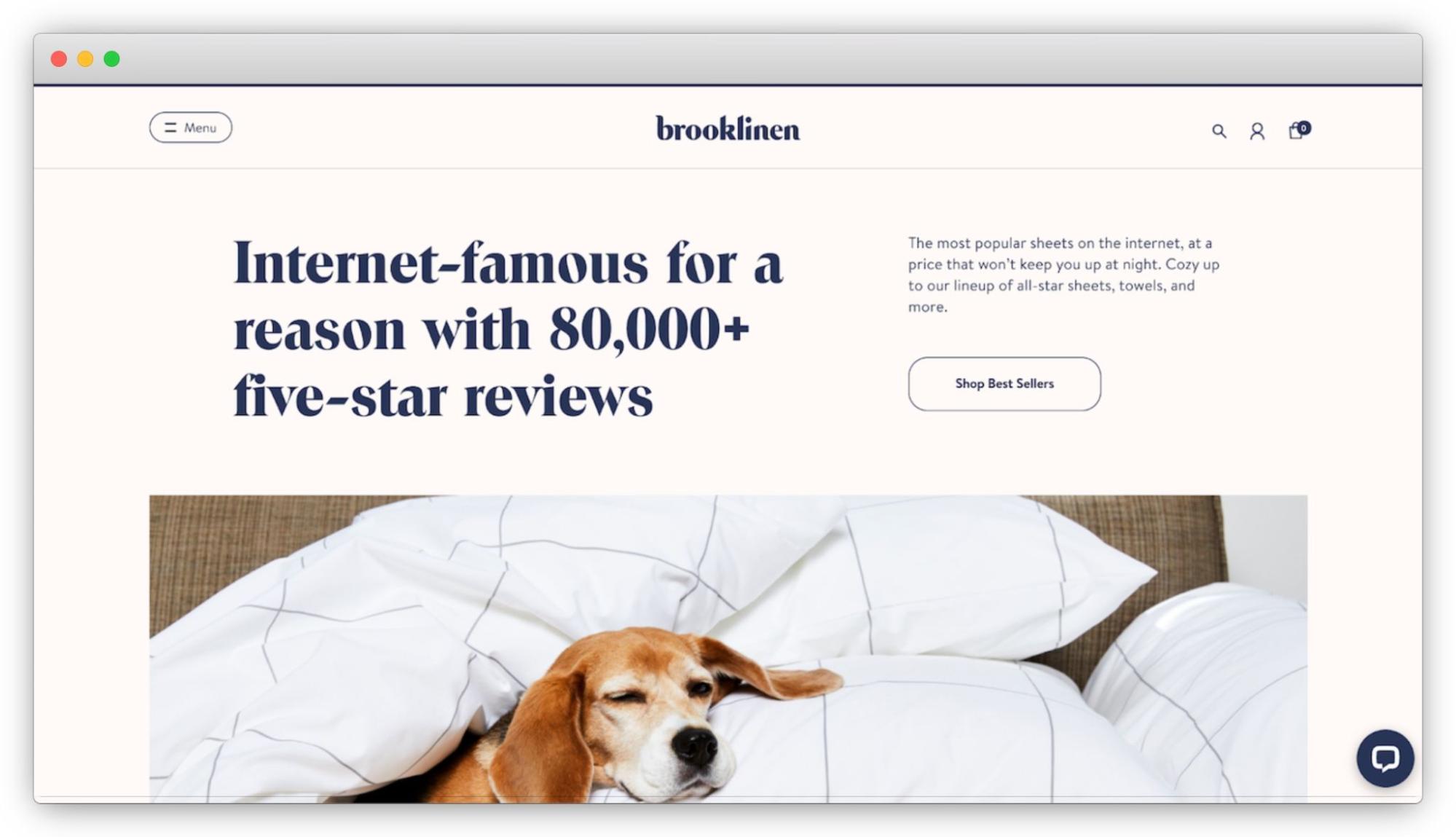
Notice how Brooklinen uses straightforward copy in their tagline and minimal background to create a clean customer experience. The large copy ensures customers understand the company’s legitimacy.
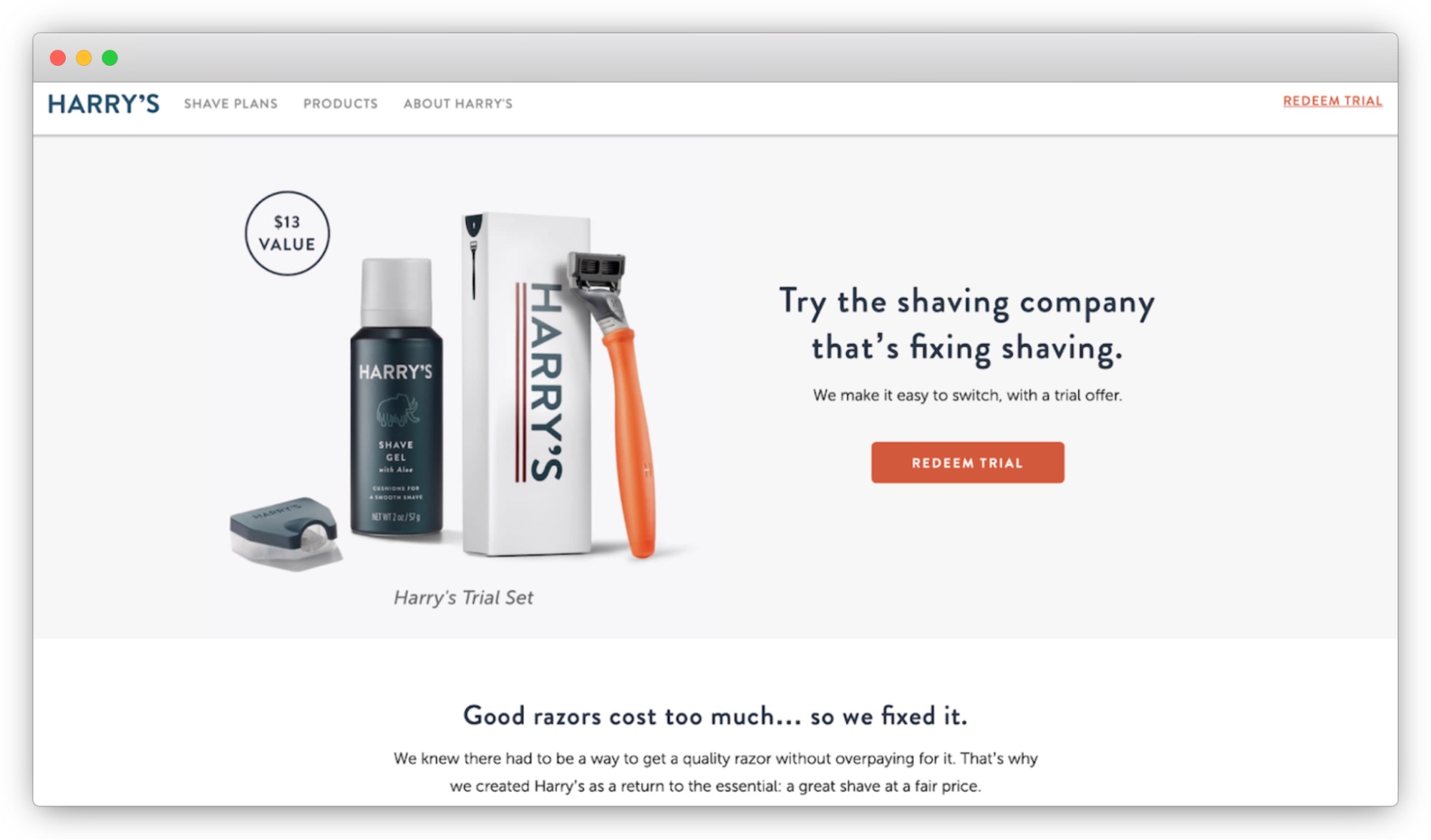
On Harry’s homepage, the minimal background helps emphasize the product so customers can quickly decide whether or not they want the product. In addition, their simple tagline on how to start using the product lets customers feel confident about their purchase.
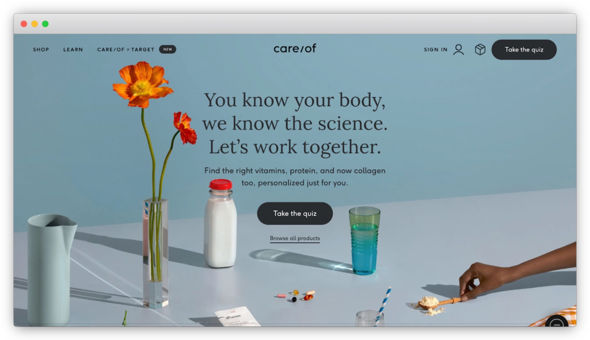
The care/of homepage instantly lets customers know how it can solve their pain point: by purchasing vitamins. In addition, their “Take the quiz” offer immediately helps customers navigate their various products.
Step 2: Use Progressive Disclosure
Customers can come across any part of your website, not just your homepage. They can also jump from online to offline at any speed. Therefore, your design elements must be consistent.
The best way to accomplish this is by creating navigation that is as simple as possible. First, think about what your customers are looking for and ensure that it is at the top. Then you can progressively show the secondary information in the dropdown menu.
I recommend these elements for navigation:
- company logo
- 3-7 main links
- 3-5 utility links
- a search bar
Using these elements removes any disruptions. No matter where or when your customers are online, you deliver value at every touchpoint. You are also helping your customers along their purchase journey by providing a consistent experience. These frictionless interactions let customers know what to do and expect next to make effective shopping decisions.
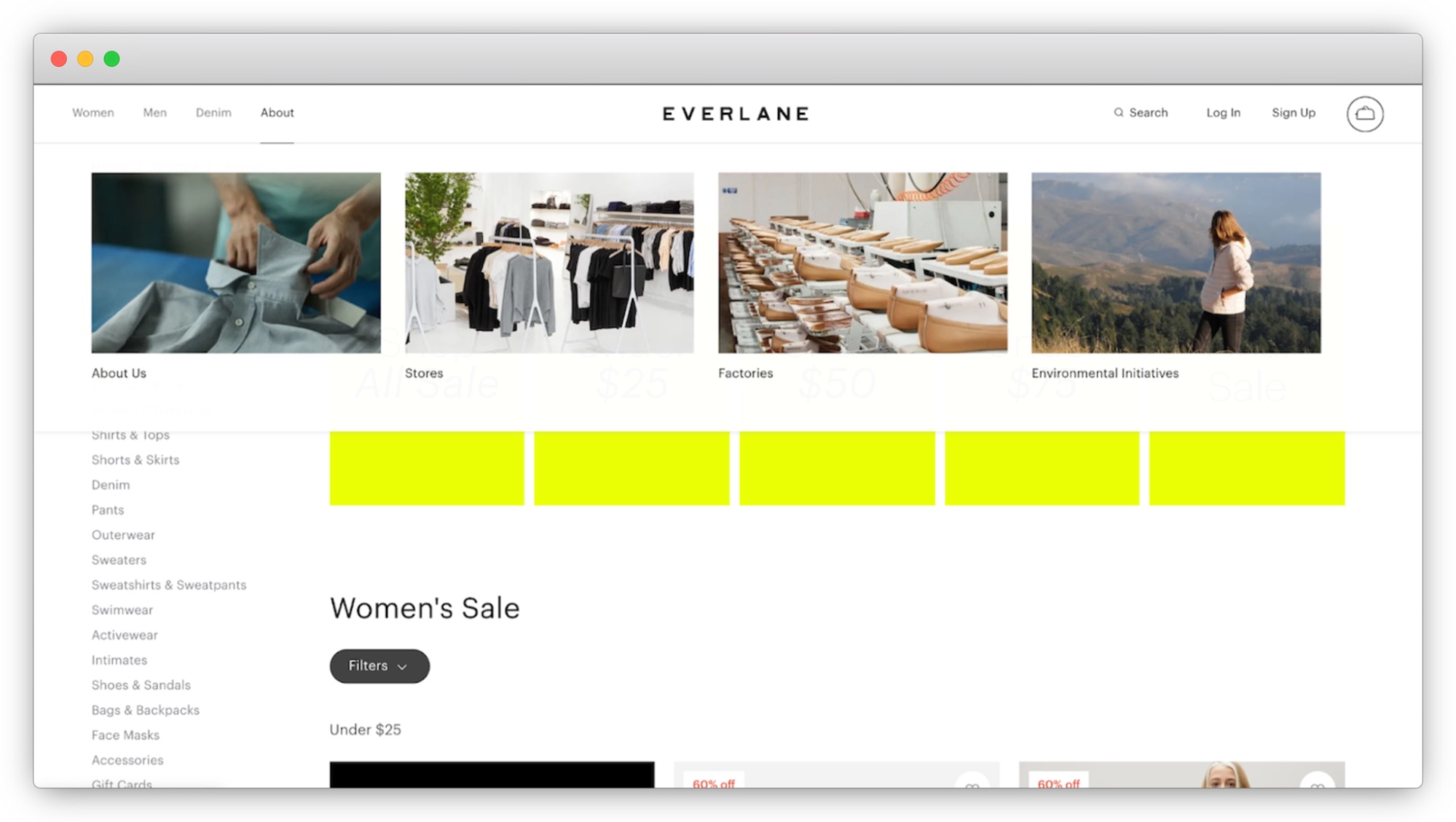
See how Everlane has top categories on their header. After clicking on the main pages, their secondary information appears on the side.
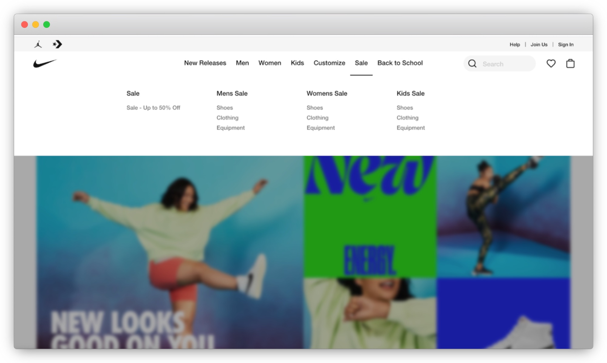
Notice how Nike lets users view sales by their top categories. This helps customers refine their search so they can make effective decisions.
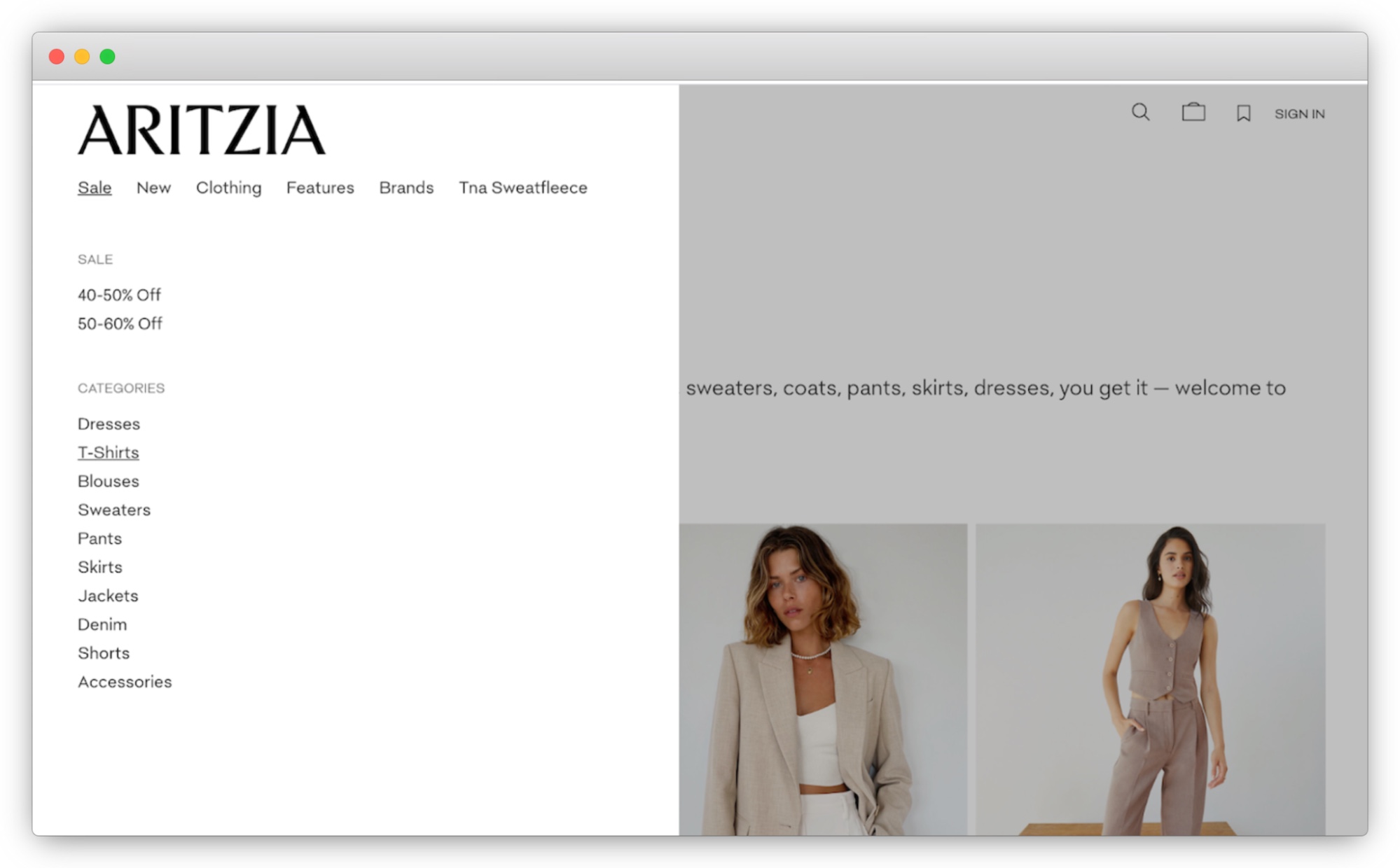
On the other hand, Artizia offers two different ways of searching their sales: by discount and category type. Doing so lets customers shop more efficiently.
Step 3: Make It Responsive and Adaptive
Customers searching for products across various platforms, such as mobile phones, watches, and tv kiosks, expect consistency across every channel. This includes being consistent with your brand, packaging, color, and tone of voice. Such consistency communicates professionalism and reliability, motivating customers to buy your products.
One of the best ways to deliver a consistent experience is through your logo. First, think about how users will visualize your logo on their phones and watches. Then, rather than creating an entirely different version of your logo to make it fit on various channels, you can have a baseline. From there, you can strip away non-essential elements. Doing so lets you keep the core design elements that customers will consistently recognize in multiple scenarios.
Google can present its design elements or simplified logo on smaller devices. No matter what, their branding is consistent.
By adding taglines or slogans, Nike can extend their branding to different situations. Doing so has also led to more partnership opportunities.
In every situation, the slash mark in the care/of logo appears. It’s even visible in the browser tab, making it easy for customers to identify.
Step 4: Use a Card Design
As customers continue to expect personalization from e-commerce brands and retailers, design elements must follow suit. However, having to make every piece of customized content would take too long and is not scalable.
To avoid such time-consuming work, use a card design. It uses building blocks to organize your content by highlighting essential information in a simplified way. A card design also balances storytelling and design elements by avoiding clutter and too many messages. You can scale cards for different breakpoints and manage spacing compositions for different device sizes.
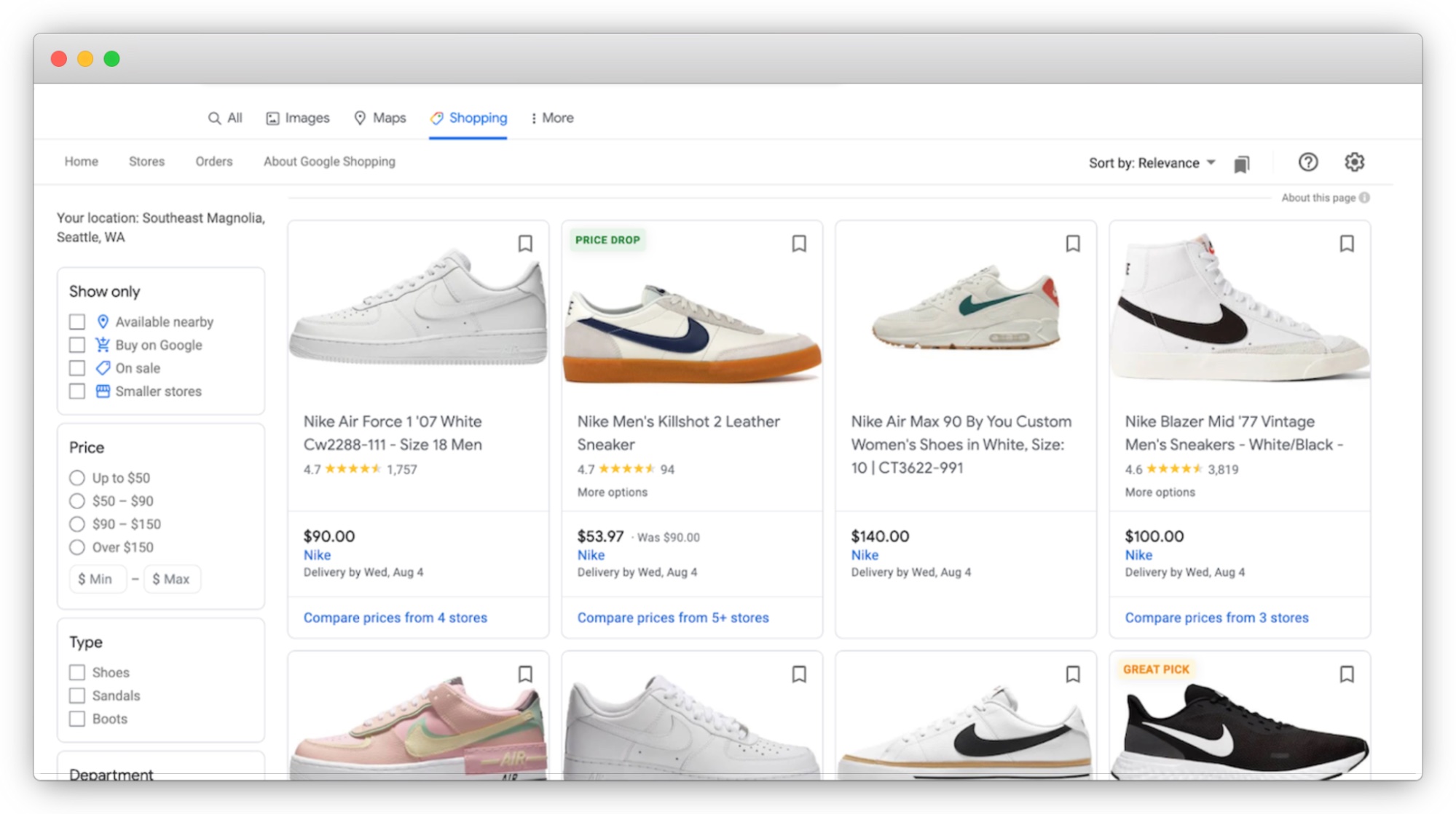
Google showcases the key information in cards, making it scalable to add or remove information based on the type of item.
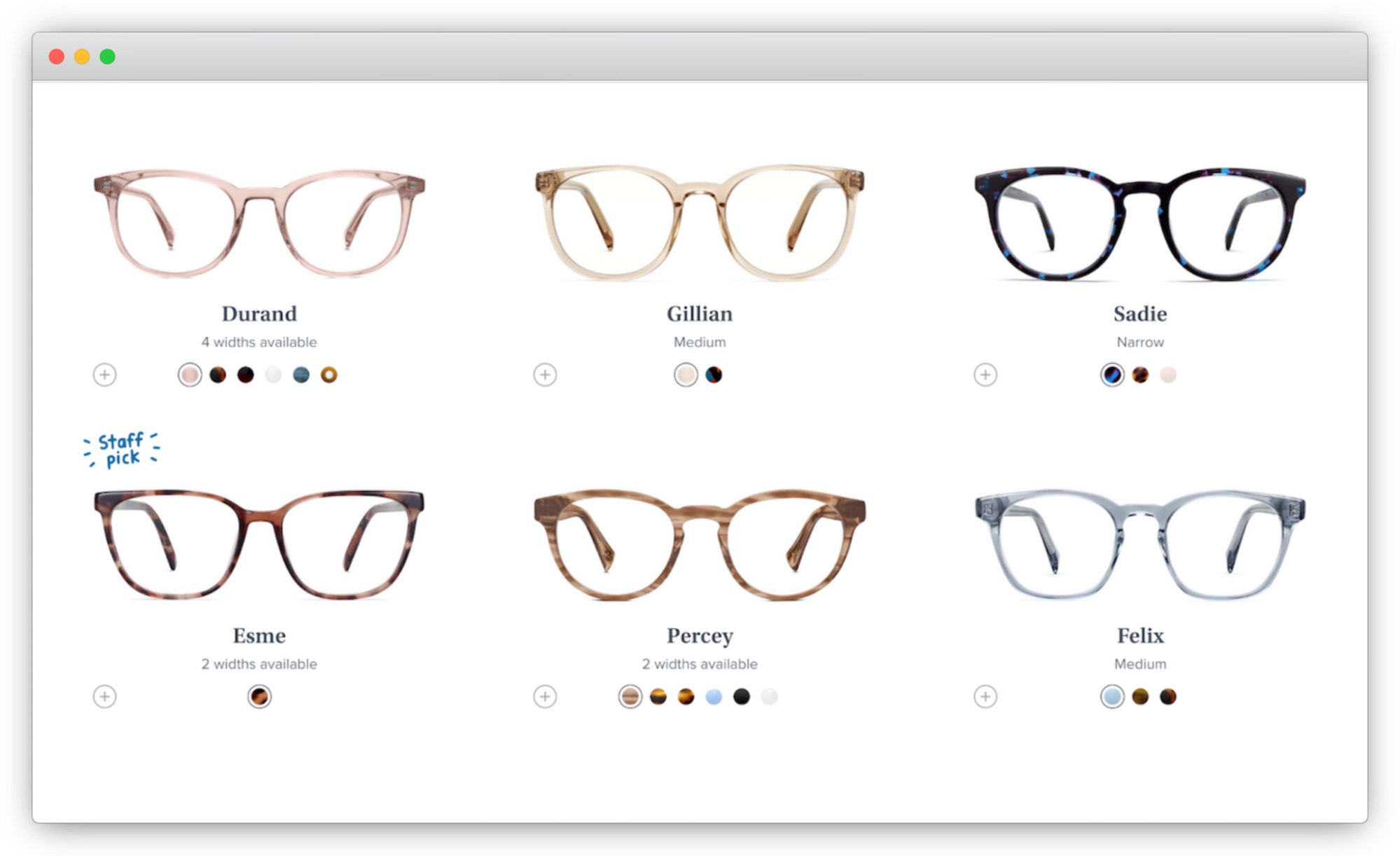
By adding branding elements, Warby Parker presents cards in different ways to make an item stand out.
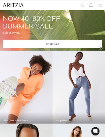
Aritzia can easily scale down to mobile and tablet with a card design without disrupting the image and copy.

User experience designer @ fabric. Previously @ Volaris, Kiva, and Ashoka.
Related Content


