
Now more than ever, mobile user experience (UX) is crucial in a time when users will bounce in seconds if the experience doesn’t meet their expectations. Many users begin their purchase journeys on mobile devices. Our conversion rate optimization team often finds that mobile conversion rate is one of the biggest opportunities for an ecommerce site to increase their revenue.
But how can brands and ecommerce retailers effect positive growth for their website’s mobile conversion rate? This article outlines three areas where you can improve mobile user experience without testing.
Mobile Conversion Rate Tip 1: Typography
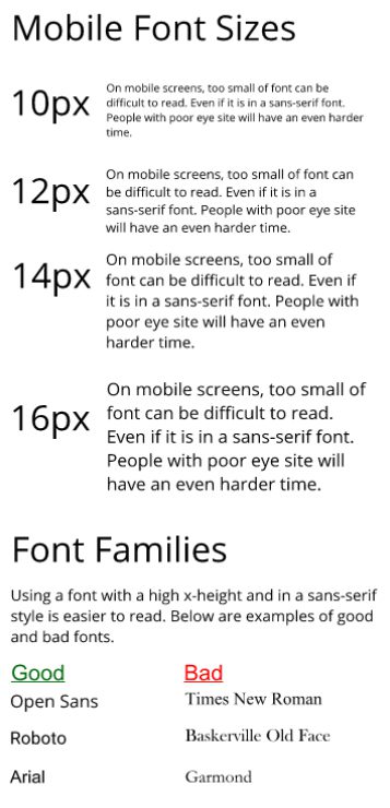
Update your website to use a sans-serif font that is at least 14px.
It is a widely accepted best practice that websites should use a sans-serif font. Even though mobile screens are getting larger and have a higher resolution, they are still not as easy to read as printed paper. Sans-serifs are easier for the eye to read on a digital screen because they tend to be more uniform in line thickness. Additionally, their lack of “feet” (i.e. serifs) keeps them from bleeding into one another.
Font size is also crucial. The recommended body font size is between 14px and 16px – this often depends on the font used for the website. Fonts with large x-heights end up being larger fonts altogether. The x-height is used to measure the true size of the main body of lower case letters, due to its lack of an ascender (like the lowercase “i”) or descender (like the lowercase “y”).
This may sound confusing, so here’s a quick explanation on the concept, direct from the experts at typedecon:
Typefaces with very large x-height relative to the total height of the font have shorter ascenders and descenders and thus less white space between lines of type. Sans Serif typefaces typically have large x-heights.
Mobile Conversion Rate Tip 2: Tap Targets
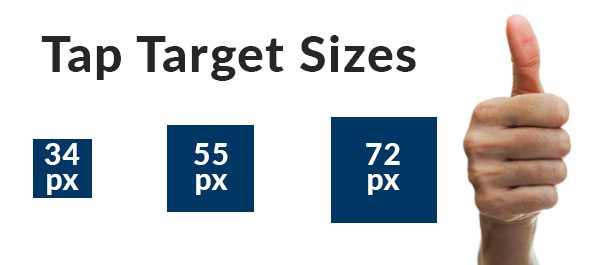
Crawl your entire website on various mobile devices, noting any tap targets that are smaller than 44px, then work on increasing their size.
On mobile devices, tapping is the main point of interaction. A mobile tap is the equivalent of a desktop click. Most people use their thumbs to tap. The natural inclination is to use the pad of the finger. However, if the tap target is visually small, users will try to use the tip of their fingers to be able to better see the target.
If a tap target is too small, a user might not be able to actually tap it and this will cause frustration and increase bounce rate. If there are several tap targets grouped together, there is the possibility of accidentally tapping the wrong icon or tapping two at once. We’ve all experienced that moment of frustration when we thought we hit one button but another one was tapped by mistake.
Don’t do that to your users!
Many different mobile UX guides have recommendations on the size that tap targets should be. These recommendations range from 28×28 pixels to 44×44 pixels.
A study from the MIT Touch Lab found that the average index finger is 45-57 pixels and the average thumb is 72 pixels. These are the primary fingers used for tapping on mobile devices. These sizes should be taken into consideration when determining how large a website’s tap target should be—the larger, the better!
A tap target closer to 72 pixels can speed up users navigation on a mobile website, leading to a better user experience.
Mobile Conversion Rate Tip 3: White Space
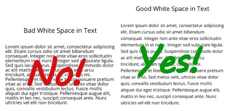
Skim through some content-rich pages on your website. Is the text is easy to read with sufficient white space between letters and lines? Scroll through pages that have groups of similar content and determine if it’s clear which content goes together.
White space is the space that is around content, images, and graphics. This is extremely important on a mobile device because having white space helps with legibility and delineating tap targets. A lack of white space can cause a user to feel confused and can even distract them from the task you want them to take.
White space can be used group like items in the user’s mind. This can help when looking at product categories, similar products, and other content that is similar in appearance or type. The closer items are together, the more likely they will be similar.
Having white space isn’t leaving space unused. By using white space in proper ways, you can increase users’ comprehension of your site, helping them move through the funnel with ease.
Hopefully these mobile conversion rate tips will help you to turn your website into a mobile moneymaker. If you’re still struggling, or looking for additional ways to optimize your mobile experience, you need to sit down with one of our conversion optimization experts.
Schedule a 20-minute opportunity analysis today and our team will diagnose areas of greatest opportunity for your website. You’ll leave with a clear action plan of how to meet and exceed your conversion goals, with actionable takeaways to lead you down the path to profitable growth.