Have you ever wondered what’s the first thing that catches online shoppers’ attention when they enter an ecommerce website?
Without a doubt, it’s the user interface design of the landing page.
In a way, your landing page is the online equivalent of a shop’s window display.
If the design is user-friendly, visually-appealing, and optimized for conversion, you’ll certainly attract more potential customers, wouldn’t you agree?
If, on the other hand, the design looks outdated or the interface structure is chaotic, it’ll most likely drive your website visitors away, which I assume is the last thing you want.
So, what makes an ecommerce landing page truly effective?
I’ll give you all the essential info on creating high-converting landing pages, but first, let’s see why ecommerce landing pages are important for your online business and cover the key elements every successful landing page should include.
Table of Contents
Why Are Ecommerce Landing Pages Important?
Simply put, landing pages have the power to convert website visitors into customers. They achieve this not only by visually showcasing the services or products your business offers, but also by emphasizing their value, establishing trust and credibility with your audience, and ultimately, persuading them to make a purchase.
Here’s what a successful and attention-grabbing landing page should contain:
- Compelling headline and copy
- Keywords and lead capture
- User reviews and ratings
- Social media buttons used to share the product or service
- A concise and eye-catching call-to-action
- High-quality images
If you have more than one or two landing pages on your ecommerce business, you’ll have a bigger chance to increase your profit rates and turn those clicks into actual sales.
As a matter of fact, ecommerce businesses that had ten landing pages but decided to take the risk and create an extra five noticed an astonishing 55% enhancement in their website’s traffic!
But before you go on and start creating landing pages, you must determine your target audience. Let’s dive into the basics of understanding your customers’ needs and wants.
Define Your Customer
The only way to make your landing pages successful is to tailor them so they resonate with the right people, or in other words, your target audience. These are the people who are interested in and find value in what you sell, so it’s crucial to understand their wants, needs, and pain points.
I’ll get into the specifics of how you can define your target audience in a bit, but first you need to understand what you’re selling so you can explain how your products or services will benefit them.
This rule is most important for beginner merchants or merchants who have included a brand-new product on their website. Once you know what exactly you’re selling, what’s the product’s purpose, what issues it can solve or how it can benefit others, you’ll be more likely to know who your specific target audience is.
In addition to that, there are various methods to conduct research and create customer profiling to learn more about your target audience, so let’s cover that next.
Conduct Market Research to Understand Your Audience’s Needs, Wants, and Pain Points
Every merchant should assess and analyze their customers’ responses to their products if they want to gain valuable and relevant information on how to improve them, and with that improve their business.
Luckily, nowadays, you can choose from various analytics tools for customer assessment that can help you gather in-depth data on your customers’ demographics, as well as their behavior, needs, wants, and pain points. Here are a few practical methods that you might find helpful:
Feedback Surveys
Feedback surveys can help you gather in-depth information on how your customers feel about your products and business. By doing surveys, you can also get information on your customers’ psychographics and demographics.
To improve your landing page design, you can add questions about the look of your landing page, whether they are satisfied with the interface design, what they’d change or improve, how to make the buying process easier for them, etc. The questions should always be open-ended so your customers have the chance to formulate their answers according to their personal experiences.
You can also add questions about their profession, gender, age, annual salary, and hobbies, so you can analyze what influences them to buy a specific product.
You can either put the survey on your website or send it via email to all of your previous and current customers who have left their emails.
Also, don’t forget to ask a question or two about the product’s impact on your customers’ lives. The answers can be pretty useful for your research, particularly from your most recent customers since these results show the latest responses, so they’re the most relevant for improving your business in the near future.
Research on Brand Awareness
In addition to feedback surveys, you can conduct research on brand awareness that can help you gain insight into the most valuable key features of your ecommerce business that your target audience notices whenever they enter your website.
This research can show what your primary audience thinks about your brand and which products or specific details about it help them recognize and distinguish it among similar brands. After assessing the answers, you’ll learn if there are specific design solutions that can improve your landing page.
Use Google Analytics
Once you gather enough surveys and finish your brand awareness research, you can use analytics tools, like Google Analytics, to learn even more about your customers’ preferences, wants, needs, or even pain points.
You can analyze the daily and weekly organic and paid traffic on your ecommerce landing page, the time your customers usually spend on various pages of your website, their engagement on social media and interest in particular products, etc.
You can conduct this research for at least two to three weeks, after which you can start analyzing the results. This will ultimately help you refine, improve and optimize your landing pages so they can fully serve your customers’ needs.
Now, let’s see which key elements will help you create a successful landing page that will attract your customers’ attention.
5 Features of a High-Converting Ecommerce Landing Page
In this paragraph, we’ll learn more about every successful landing page’s five most important features. If you want to improve the traffic percentage on your website and gain more clicks on your landing pages, make sure to remember: optimization is key! You can improve them by using the five clear-cut methods below.
- Clear and Compelling Headline
Your landing page will only be successful if you include a concise yet engaging and compelling headline. If the text in your headline doesn’t make sense and leaves your potential customers confused, you’re not doing a good job.
Check this example of a clear headline on FIGS landing page:
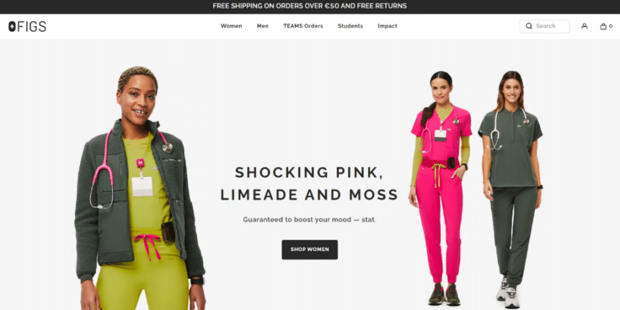
The text is neither too long nor too short, and you can immediately understand what this page is about: signing up for Marley Spoon’s newsletter.
The visuals of the landing page are also intact with the rest of the website’s visuals, and the fresh and vibrant color palette suits the website perfectly, considering that the business sells fresh products with a shelf life.
- Attention-Grabbing Visuals
The second thing you should focus on is including attention-grabbing visuals on your landing page. Although adding interesting and unique graphic solutions is always a good choice, you should never go overboard. Keep one thing in mind when working on your visuals: less is, indeed, more.
Let’s take FIGS’ visuals as an example.
The visuals are bold, and the color palette is playful, but still, the page is not overloaded with information, visual elements, or features that can confuse the reader.
So, what’s the takeaway?
While you should keep things energetic and lively on your landing page, don’t add too many elements or color palettes that are either too strong or too dull. Make sure to follow the latest UX/UI design trends, so you and your team can create an engaging landing page without making it seem too confusing for the visitors.
- Social Proof
Adding social proof to your landing page is optional, but it’s a great move that contributes to the effectiveness of a landing page. Potential customers love to read about the past experiences of customers who have already purchased the product.
If you want to give them an opportunity to get more detailed information from your previous customers’ first-hand experience with the product, you can either add a product reviews or ratings section to your landing page.
If you’d rather not add a whole section of ratings or reviews, try adding a few customer testimonials: brief quotes and statements from your customers. Also, there’s always an option to add a brief video if the product you’re advertising is extremely popular. If you have a big budget for your landing pages, consider shooting a quick video with your customers speaking about the product.
- Product Benefits and Features
One of the most important things in marketing is to communicate with your customers. And the best way to help customers distinguish your product from other similar products by your competitors is by adding their main features and benefits.
For example, if you’re selling winter jackets, you need to add the tangible features (like the materials they’re made of) and their benefits, such as their function to keep you warm during cold temperatures or winter storms.
Make sure to place them in the central part of the landing page, and if you have a “Product Details” section – even better.
5. Strong Call-to-Action (CTA)
A high-converting landing page always has a clear, straightforward, and strong call-to-action. By crafting an excellent call-to-action, you’ll keep all of your website visitors engaged and interested in learning more about the services or products you’re selling.
In a nutshell, the CTA’s main goal is to encourage website visitors to complete a desired action, like signing up for a newsletter or purchasing a product. Although there’s not one successful call-to-action model that all merchants can use, there are a few things to focus on to personalize and optimize it as well as you can:
- Copy and language
When it comes to CTA buttons, the first and most important rule is to keep things brief, concise, and eye-catching. The usual phrases used on landing pages are “Shop Now,” and “Click here to learn more.”
- Image placement
Image placement also plays an important role in any call-to-action strategy. People are always attracted to colors and visuals, so the image is probably the first thing they’ll notice while browsing your landing page. The image should always be placed either in the center or, as it is usually, on the left side of the page.
Also, high-resolution images are essential for any ecommerce business, so avoid using low-quality images. Low-resolution photographs are distracting and simply won’t represent your brand or the product as serious or legitimate.
- Button placement and color
Proper button placement and use of color on your landing page are essential. The button should always be placed in the central part of the page, so your customers won’t have to scroll or browse through to the end of the page to find it.
Color is another thing to consider when you’re creating your call-to-action. Did you know that the color you use can have a major impact on your sales revenue? For example, when the brand Andreas Carter Sports changed its button color from green to blue, they noticed an increase in click-to-sale conversions by an astonishing 50%! So, don’t underestimate the power of a unique-colored button.
4 Tips on Designing an Effective Ecommerce Landing Page
When you start designing a new ecommerce landing page, keep the following tips in mind. Trust me; they’re a real game changer when it comes to improving a new customer’s journey!
- Keep It Simple and Focused
If you want to make your customers fall in love with the product, keep the text and design of your landing pages simple and focused.
The text, design, and images that you choose to include in your landing pages have one specific goal – to introduce the product you’re selling accurately, and in the best light possible.
If you add too many unnecessary details or mention additional stuff that is not connected with the product, then you’ll confuse your customers about the product’s purpose and your ad’s primary goal.
Adding way too many elements, colors, text, or buttons can distract your customer from your primary goal: to introduce them to a product and encourage them to buy it.
- Use Consistent Branding and Design Elements
If you want to attract new customers to your ecommerce website, always use consistent branding and design components. When you create a landing page, your goal is to deliver the message loud and clear, so when someone clicks on the ad, they’ll expect similarities between the ad and the landing page.
If there aren’t many similarities, they might feel like your business is not transparent, so customize your landing page’s style to fit your ad and brand overall, and present your products in the best light possible.
- Optimize for Mobile Devices
This one’s pretty self-explanatory: optimizing your landing pages for mobile devices should be one of your priorities, since a lot of people will probably end up on them through their smartphone, not their laptop. If you want to reach more people, you’ll have to expand your budget and get an excellent UX/UI designer to optimize your landing pages for all sorts of smartphone screens.
- Do Split Testing
Before the landing page goes live, you need to make sure all of the features and UX/UI components are functioning properly and are clickable. If one of the buttons is not working, page visitors might get confused and leave the page as it will seem like it’s not legit.
That’s why testing every single detail matters. During the testing process, make sure to check all the clickable pages, the image placement, and go through the text one more time. A landing page is certainly not the place you want to overlook a typo!
How to Write a Killer Copy for Your Landing Page?
Now that I’ve covered the design aspect of a landing page, let’s see what you can do to create a brilliant, eye-catching copy.
Here are four tips for your landing page copy that will elevate your game to the next level.
- Keep it Concise and Scannable
When it comes to creating an excellent copy, keeping things short and sweet is key. Here’s what you should consider when preparing the copy:
- Who is your target audience?
- What is the purpose of the product you’re selling?
- How can the product benefit your customers?
- Why is your product important for your target audience?
Once you put these four questions into perspective and answer them through your copy, your landing page is good to go!
- Use Persuasive Language and Strong Verbs
If you want to emphasize a product and show your landing page visitors how awesome it is, stay away from flat and cold phrases.
Most people will simply choose not to engage or click on a page if the messaging is not friendly, witty, or interesting in some way.
Using friendly phrases makes people want to engage with the website instead of ignoring it, since it catches their attention and makes them feel good about the product that’s being advertised.
I encourage you to use persuasive language and strong verbs, but don’t overdo it. If you start pushing it too far, your page visitors will get distracted by the strong language and click on the x button in the blink of a second.
- Highlight the Benefits of Your Product
When we end up on a landing page, we’re expecting to learn more about a specific service or product and its main benefits and features.
For example, if you’re selling a clothing item, you’d want to emphasize the most important details of it that make it more unique than other similar items to get your visitors hooked instantly.
Make sure to add specific features that make your product stand out from similar ones on the market, and place them centrally so your potential customers can read about them before they start browsing around or clicking buttons.
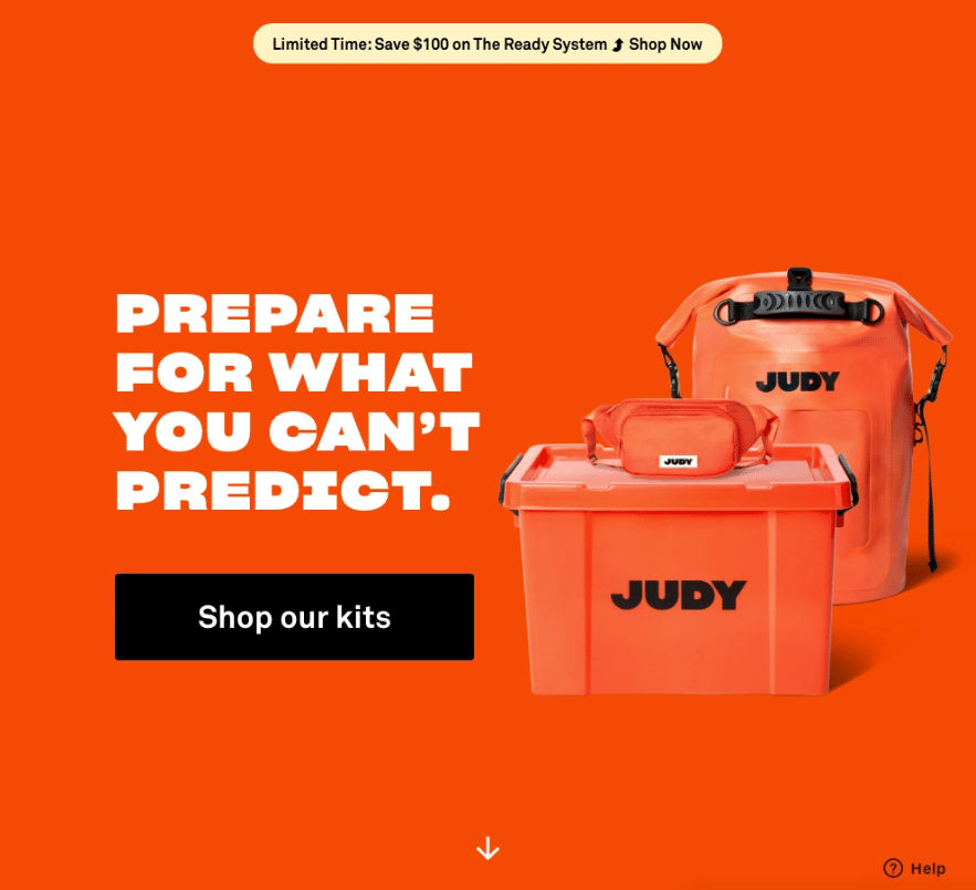
- Create Urgency With Limited-Time Offers or Scarcity Tactics
If you’re advertising a product with a limited-time offer, you’ll need to enhance how long that offer lasts and how unique it is. For example, if the product’s 70% off, that should be the first thing your visitors notice when they enter the landing page.
The second thing should be the timeframe of the offer. Include time-sensitive offers in the ad, too, so they’ll have more incentive to actually click on them.
Time To Get Creative With Your New Landing Page
Now that we’ve come to the end of this article, do you feel ready to start implementing our innovative tips and tricks into your landing page?
You now know all about the importance of creating top-notch landing pages, the main elements that make them unique, and the best practices for designing landing pages and writing effective copy.
I hope this inspired you to take on your next creative journey and turn those clicks into profit!