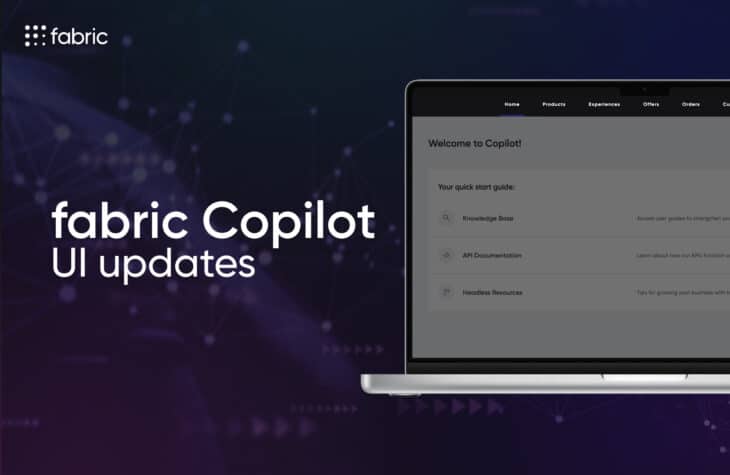
Design System 4.0: A Newer, Faster, More Intuitive Experience for fabric Copilot
Good design is a differentiator, which is why we are excited to launch fabric’s new design system to power the next evolution of the fabric Copilot merchant user interface.
Our design system is always evolving, enabling fabric to grow and shape the future of commerce, and empowering you to unlock innovation for every user within your organization.
fabric’s new Design System 4.0 delivers a user experience for fabric Copilot that is more seamless, intuitive, and enjoyable to use than ever before.
What is good design? In your day-to-day life, you might not think about good vs. bad design, but you inherently feel it. When it’s good, a button or navigation feels like it almost anticipates your next move, taking you exactly where you expect to go. When it’s bad, you get lost in trying to figure out what to do next rather than the job you actually set out to do.
But why is good design important? “Put simply, good design leads to faster speed of execution,” says fabric Vice President of Design & UX, Muriel Naim. “In a world where we are challenged to achieve more with less, users need interfaces that are fast and intuitive. When your teams have access to interfaces that look and feel like experiences they’re used to, they can embark on self-serve journeys that require less training and enable stronger focus on the tasks at hand rather than where to click next.”
At fabric, we view good design as a differentiator. And that’s why we are excited to launch our new design system powering the next evolution of our fabric Copilot merchant user interface.
Design: Mixing Art and Science to Drive Impact
We believe in building, marketing, selling, and delivering our products as if we are the customer. From a design perspective, this requires extensive research, which includes talking to customers and looking at both in-market and out-of-market comparisons.
After looking at in-market comparisons, we not only gained an understanding of what the customer expects to see, but we also noticed key gaps in the offerings available today. That’s why being best-in-market isn’t good enough. Users need interfaces that are best-in-class.
We also looked at market leaders from Google to Slack to Adobe to understand what’s performing best in the digital landscape. This approach has allowed us to deliver an experience that is seamless, intuitive, and enjoyable to use.
More Intuitive Means More Time on the Right Tasks
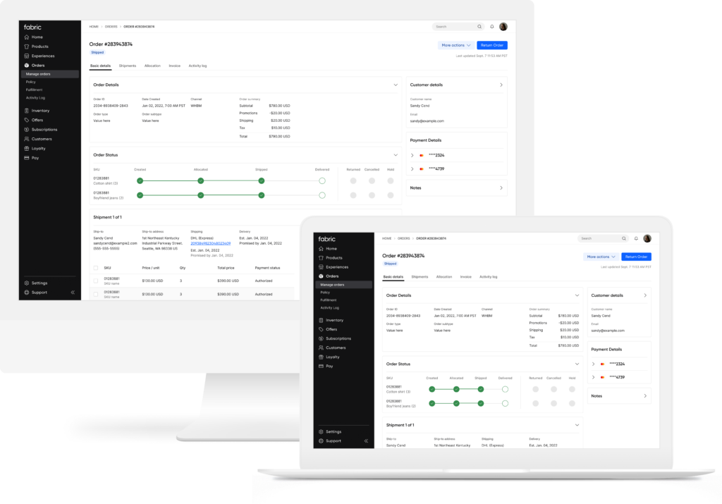
Your teams need access to an interface that speeds up their workflows – whether it be deploying a new promotion or editing and viewing order details. They can’t get stuck at dead ends, lost in navigation, or find themselves googling what a specific acronym means.
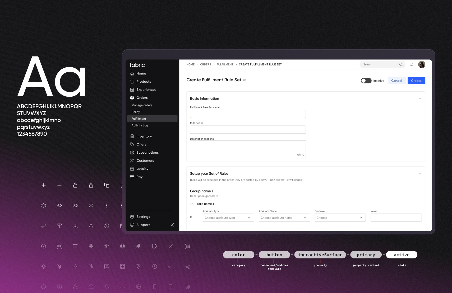
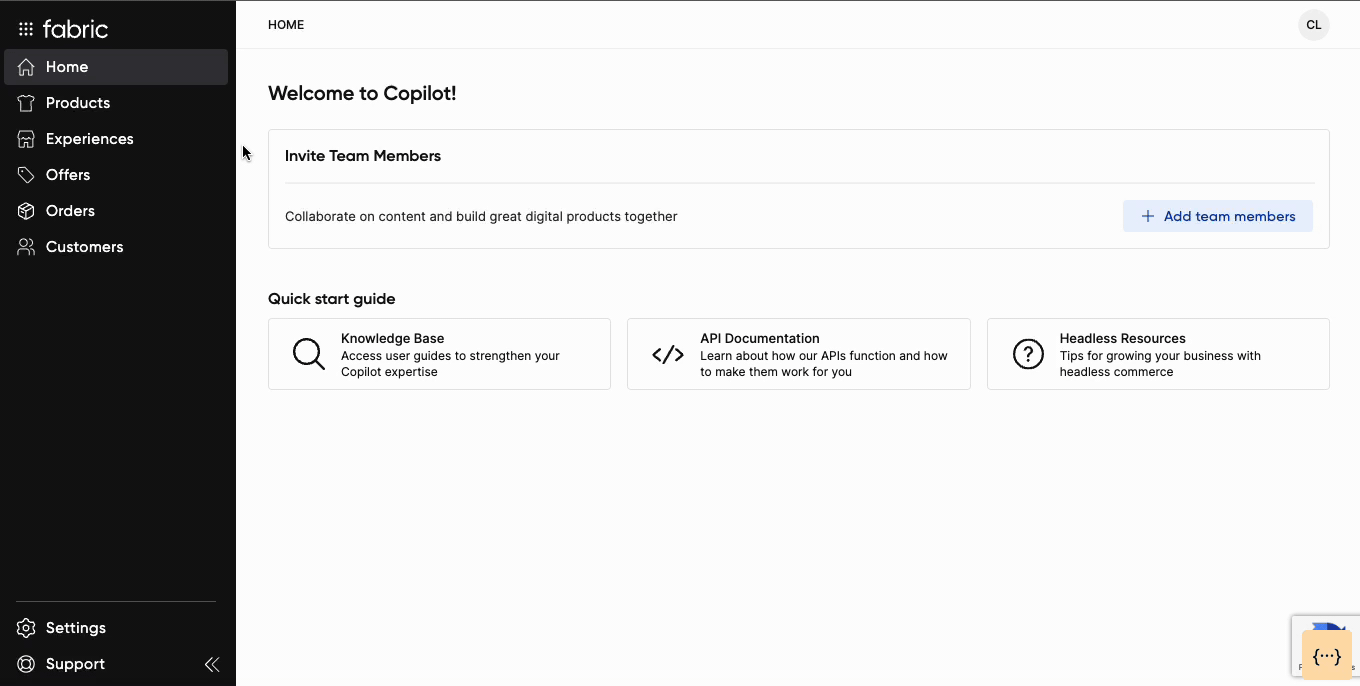
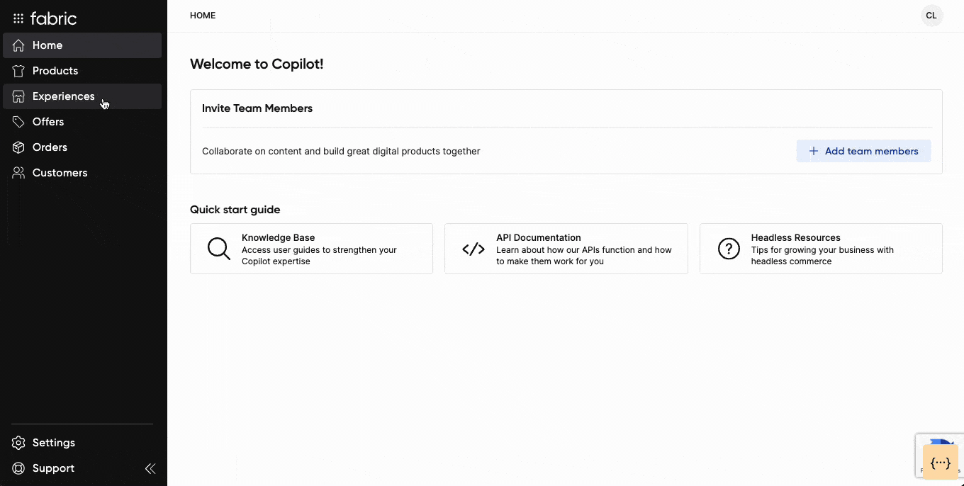
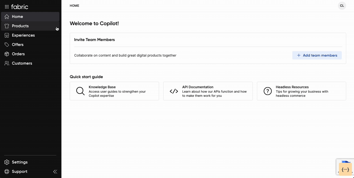
We took all of this into consideration as we updated our information architecture and interface design. As soon as you log in, you’ll notice a new navigation experience on the left side of the screen that stays with you, remaining the same wherever you go and providing “bread crumbs” at the top to show you exactly where you are within Copilot. Each click is a direct, obvious path; switching between screens is seamless, and you always know exactly where to go next.
We also removed acronyms. Acronyms distract, causing you to spend time processing what something means and where to click next. The simple, intuitive language allows anyone new to the Copilot experience to get up-and-running quickly without needing significant training.
Finally, we centralized the settings to provide one location to handle application and account settings, as well as developer tools. You can get there regardless of where you are within the Copilot experience, meaning you don’t have to waste clicks if you are deep down the path of finishing a stacking promotion or editing attributes of product variants.
Productivity Unlocked Within the Interface
While we love our new navigation, we know that you don’t always need to see it. Sometimes you need as much screen real estate as possible for focused work. That’s why we’ve made it possible to expand and collapse navigation, removing unnecessary distractions.
But productivity unlocks don’t stop there. Search and filtering works best when you don’t have to think deeply about it. They should assist in getting you to exactly where you need to go. We’ve added a smart filtering system that allows you to select certain criteria on top of your search to narrow down results. Don’t worry, if your search comes up with zero results, we’ve predicted where you might want to go and we’ll provide those suggestions.
Adaptability to Meet You Where and How You Work
Finally, we understand where and how people work continues to evolve. During our user research, we analyzed the most used screen sizes of Copilot users and optimized the platform to work seamlessly across sizes ranging from tablet to large screen monitors. Every design is built with responsive layouts, adjusting to the size of your screen. As you adjust your Copilot window, it’ll adjust with you, making it especially easy to accomplish tasks that require side-by-side windows with other applications.
With these updates developed specifically from how customers interact with Copilot, we’ve created an intuitive experience that instills confidence when moving to fabric for the first time or onboarding new employees. Our design system is always evolving, enabling fabric to grow and shape the future of commerce, and empowering you to unlock innovation for every user within your organization.
To learn more, or to experience the new DS 4.0 fabric Copilot for yourself, visit our developer portal and sign up for a free trial account today.

Senior Product Designer @ fabric. Former Product Designer @ GoPro and Half Helix.

Product marketing @ fabric. Previously @ Accenture and Infosys.
Related Content