Your website probably has lots of content: products, categories, text, images, buttons, articles, links, and more. With that being said, it is important to remember that it is the job of your web design to organize all that content in a logical way — helping users understand what you offer and find what they’re looking for.
One of the key principles to effective web design is establishing a strong visual hierarchy. By doing so, you are ensuring that the most important page elements are also the most prominent. This saves users the cognitive strain of determining which elements to filter out and helps them zero in on what they need.
So how does your site’s information organization stack up? Below are three key questions you should be asking as you evaluate your site’s visual hierarchy.
1. Does your main navigation menu stand out from the rest of the page?
Oftentimes, the navigation bar is the users’ main method of exploring your site. It should be attention-grabbing and encourage interaction. You will also want to make sure it contrasts with the rest of the page — its color shouldn’t blend into an unrelated header or the page body! Lastly, it should be easily readable and react to mouse hover.
Take a look at the web design, specifically the navigation bar, on the fictional “HomeImprovement.us” site below. The low-contrast gray text blends into the rest of the page, while the bold site logo and hero image take prominence. Additionally, the condensed uppercase text is difficult to read and may direct readers’ eyes elsewhere.

Through minimal changes in web design, the improved navigation bar below solves these problems. The bold black background stands out against the other page elements, and the text is easy to read, with a highly contrasting color and plenty of letter spacing.

2. Are extra web design elements distracting from more important content?
Let’s face it, we all want our web design to be beautiful, and flashy elements can be a tempting way to add that “wow-factor”. But these elements can come at a cost to your conversion rate. If web design elements draw users’ attention away from your products, navigation, or conversion funnel, they may be doing more harm than good.
One common culprit is the automatically-rotating image slider. In theory, these sliders are a great way to showcase the variety of your website’s offerings. In practice, however, they can often be distracting and irrelevant. According to a ScienceDaily article, our eyes are wired to look at new things when they appear, even subconsciously. If a slider rotates while a user is browsing your navigation menu or featured products section, they may become distracted and lose their place.
Furthermore, the content featured in these sliders is often specialized and irrelevant to the majority of your users. Often, that part of your homepage would be better showcasing your unique selling points with a single focused message, rather than displaying extraneous content that serves to distract users.
3. Is the most important button the most prominent one?
The web design principles of visual hierarchy are especially important in scenarios with many points of user interaction, such as a shopping cart. A well-organized hierarchy of actions helps both you and the user: it prevents them from being overwhelmed by too many options of equal prominence, and it allows you to guide them toward the action you’d like them to take.

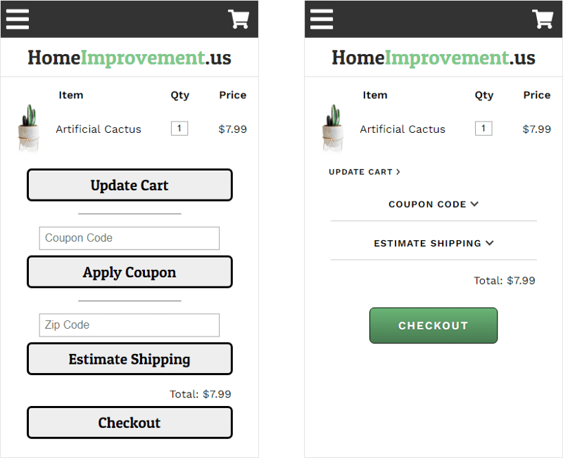
Look at the mobile shopping cart for the fictional “HomeImprovement.us” site on the left. There are four different user interaction buttons, and all are given equal prominence in the visual hierarchy. The user is not guided toward one button, but instead has to consider each one and decide whether it’s what they’re looking for. Even worse, the most important action – progressing to checkout – is at the bottom of the page, and may even be pushed below the fold if there are multiple items in the cart.
The improved shopping cart on the right solves these issues. Clear prominence is given to the “Checkout” button, with a unique color and plenty of padding. The other actions are de-emphasized. The “Update Cart” button is smaller and closer to the items in the cart, where it contextually belongs. The “Coupon Code” and “Estimate Shipping” buttons have been made into accordions, so those input fields only appear when the user clicks into those areas. And these changes take up a lot less vertical space, so more items can be added to the cart without pushing the “Checkout” button below the fold.
Alternative web design options could include placing an additional “Checkout” button above the cart items or placing the “Checkout” button in a sticky bar at the bottom of the screen; these web design elements ensure the button’s prominence is never lost.
Still Need Help?
If you are looking for even more conversion tactics, as well ways to improve your site’s visual hierarchy, grab our latest white paper: The Q4 Conversion Rate Challenge. This detailed report will uncover further strategies to optimize your website and improve conversions.
For even more insights, you can visit our website and get in touch with one of our CRO experts. They can outline key areas of your site that are ripe for testing and help you down the path to an optimized customer experience and a better converting website.


